AkzoNobel reveals the Color of the Year 2022
Contact usResearch conducted by AkzoNobel crowns Bright SkiesTM as the color of the year 2022. This light and airy blue is the breath of fresh air we all need.
After a period of feeling closed in on ourselves, people want to expand. Extensive global trend research, conducted by a team of paint and coating color experts and international design professionals, reveals that we crave the outdoors, connections to the great outdoors and a fresh approach to everything.
Many events in the last two years have brought into focus the social, economic and environmental aspects of our lives. We are reevaluating what really matters: family, friends, home and the world around us.
“In 2022, Bright Skies will help us embrace new ideas and shape a new future,” says Heleen van Gent, creative director of AkzoNobel's Global Aesthetic Center. "Color reflects the limitless skies above us, giving us the space to redefine the role of our homes, nature, the arts and new voices in our lives. As consumers seek to express themselves and transform their spaces, our goal as color experts is to inspire their confidence in color itself."
The Global Aesthetic Center's annual trend analysis and color research is translated by paint and coatings experts across the company into inspiring colors, products and visual content.
“Our Paints and Coatings business uses research insights to bring trendy colored surfaces to life,” says Michael Friede, Chief Commercial Officer of Performance Coatings. “Each year, we pioneer a new world of possibilities for customers and consumers, offering market-specific colors and finishes in decorative paints, architecture, aerospace, automotive, consumer electronics and wood coatings.”
To show how Bright Skies works with a range of other shades, the AkzoNobel Aesthetic Center has designed four decorative paint color palettes inspired by the changing role of the home: Workshop Colors, Greenhouse Colors, Studio Colors and Salon Colors. The palettes make it easy to choose and combine an array of soft neutrals and joyful hues. They can be used to define zones in multi-purpose spaces, bring a sense of nature indoors, create a relaxing atmosphere or encourage a sense of unity.
The trends are also translated into the Automotive and Specialty Coatings, Coil and Extrusion Coatings, Powder Coatings and Wood Coatings sectors, based on extensive color and material research and market analysis. Tailored color palettes are developed for the aerospace, automotive, consumer electronics, metal furniture, appliance, furniture, flooring, building products and architectural markets.
More articles

E-coating or Powder Coating? 3 Factors to Consider Before Choosing
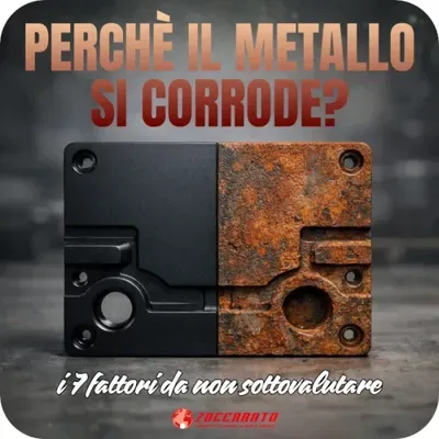
Why does metal corrode? The 7 factors not to be underestimated
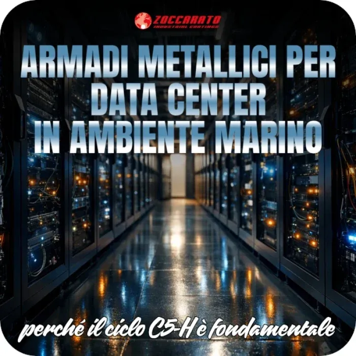
Metal cabinets for data centers in a marine environment: why the C5-H cycle is fundamental

Cataphoresis: the questions you didn't know you had (and the answers that make the difference)
Have a project in mind?
Tell us about your needs: our team will guide you to the most suitable treatment.
Contact us